


Journalism has always been about showing stories, not just telling them.
Datavisual is a new tool rooted in that philosophy.
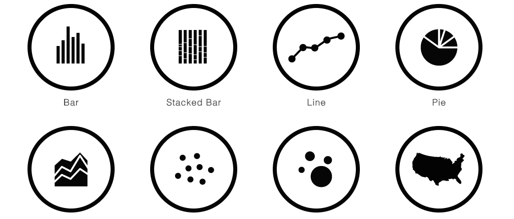
Recently launched and free to all, Datavisual allows anyone to easily create well-designed data visualizations.
“We are really just trying to help people tell stories through data,” said Danne Woo, the founder and CEO of Datavisual.
Woo said what separates it from other well-known data visualization tools, like Tableau Public, Google Fusion Tables or Highcharts, is the large emphasis on the design and experience. Datavisual requires a much smaller learning curve and less technical knowledge, while getting the same quality of graphics.
It also allows designers to create tailored and branded templates so content creators can just plug in their data.
Woo is a graphic designer and graduate of New York University Interactive Telecommunications Program. He has never been a journalist, but saw the void in tools to help non-designers create attractive graphics.
And it is easy to use as well.
Woo explained the tool in five minutes during his session, Fast and Easy Data Viz with Datavisual, at the Midway demo table.
Ginger Rough, an assistant watchdog and online editor for the Arizona Republic, went to the session to learn about another tool for easy visualization.
She said her staff really only has one data expert who tackles large-scale and in-depth projects. Rough takes on the smaller and simpler visualizations.
Most of her staff is consciously aware of incorporating more data into their stories, but they lack the skills to visually display it.
Rough said this tool is something she will take back to her staff to help incorporate more visuals in their coverage.
“We are always trying to see what’s coming up next,” Rough said.
She liked the ability to export the graphics for both web and print, but didn’t like how it wasn’t responsive since their site is mobile-first.
Jake Grovum, a staff writer for Stateline, attended the session to learn about new ways to visualize his stories.
Grovum said he has limited knowledge of coding and design, so this is a tool that could be very beneficial. He incorporates state and national data into his reporting, so the interactive maps and charts will help him break down complex stories like poverty.
Showing stories with data is Woo’s main goal behind the new tool, especially as news continues emphasizing visuals and graphics.
“Hopefully it’s just helpful,” Woo said. “If not, I want to know why so I can fix it.”