Look at your resume. Is it written in Times New Roman font and formatted in bullet points?
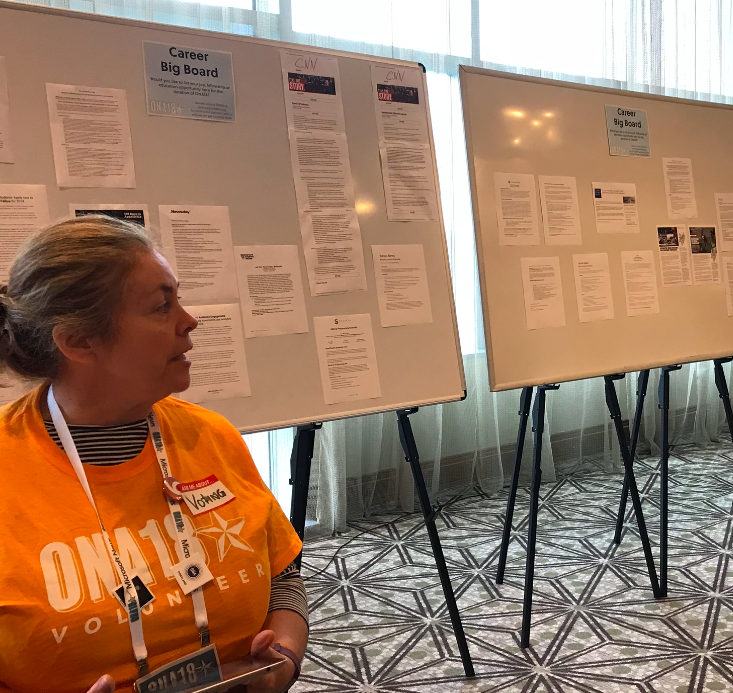
While many job seekers follow this traditional resume template, media professionals are adhering to higher standards with more modern designs and even video and graphics. Speakers at ONA18 conference discussed resume trends as part of several panels for job seekers.
Tell a story
Freelance journalist Tania Karas, speaking at a panel on early career tips from ONA’s MJ Bear Fellows, compared the resume to a familiar journalism tool: the inverted pyramid. On a resume, important information goes at the top of the page, while less vital facts should be at the bottom. She said employers look for reporters who know how to prioritize information — a skill you can show right in your resume.
Jennifer Mizgata, ONA director of programs, tells job hunters not to fret about cramming information into a resume. Instead, tell your story like a news story. Include what’s most important and save other information for the cover letter or interview.
Vignesh Ramachandran, a web producer in ProPublica’s Chicago newsroom and an MJ Bear Fellow, also suggested organizing a resume like a story. Speaking alongside Karas at the panel, Ramachandran encouraged journalists to keep their resumes clear and concise, and not to embellish.
“Don’t purposely try to fill pages to make your experience look more beefed-up than it is,” he said.
Describe your impact
Ramachandran recommends not only listing your work, but explaining its impact. Did one of your stories cause the mayor to hold a public hearing? Did you meet a specific engagement goal on social media? Was there a time you broke news? Mizgata calls these the “facts and stats to back up the story.”
Be sure to mention how you see yourself fitting into the work an employer is doing, Mizgata said. She writes a thesis statement at the top of her resumes to summarize her experience and personality. “It’s important to see that people are able to frame their experience in a way that’s relevant to employers.”
Likewise, Karas tailors her resume to the employer. She has over 12 different versions of her own resume.
Keep the design simple
Anand Katakam, another MJ Bear Fellow and data product manager at independent Indian news site Scroll.in, warns against making your resume too flashy. Showing off design skills can make you stand out in the crowd, but jobseekers should keep it clean and simple. He advised against using bright colors, because it can distract from the information you may want recruiters to see.
“Don’t let the design get in the way of the message,” Mizgata said. Always get feedback before you submit a resume, especially if you take a shot at a bold design, she said. Sometimes it helps if someone in a completely different profession puts a fresh set of eyes on your resume.
Get online
All four ONA speakers agreed that journalists should have online portfolios to showcase clips and other interactive work.
Ramachandran recommends uploading your best pieces and explaining your role in the work. Did you do the reporting? Did you work on a team? Did you make visuals?
Karas pointed out that there are plenty of free options to construct your personal website. She uses Squarespace, but has used WordPress in the past.
And always upload a PDF of your resume onto your online portfolio,Ramachandran said, in case an employer visits your website and wants to save a hard copy.
While creativity and “flash” are key, three of the four speakers still use a traditional resume format. Ramachandran keeps it classic with his resume, and takes more creative liberty with his online portfolio.
“I don’t think being able to concisely talk about your experience in a way that shows that you are capable is out of style,” Mizgata said.


You must be logged in to post a comment.