


Most news organizations these days dabble in some sort of data visualization to enrich their stories.
For journalists who are new to it, mistakes can be easy to make and could result in all their hard work looking very unprofessional.
Diana Yoo is the Art Director for Pew Research Center, and she shares some common things to avoid when visualizing data.
Is your data distorted?
Density or relativity could largely skew the data if not weighed properly in the analysis process.
This map below wanted to show that half of the United States’ Gross Domestic Product (GDP) is generated in the spotty orange areas, which seems striking at the first sight. But a fact being ignored is that 42 percent of the country’s population live in these cities. Disregarding this factor makes the map very misleading.

Are you rigorous when charting?
There are many rules to keep in mind when visualizing data. There are line charts for trends over time, bar charts for comparing categories, pie charts for showing composition. Choosing the wrong chart format might nullify your data. A non-zero baseline or inconsistent scale can visually overstate the data’s significance and distort the relationship between numbers.
With all the online tools, colorful and visually attractive Infographics are so easy to make these days. But think twice before being creative with your charts, Yoo suggested. Your creativity could turn into something inaccurate or even ridiculous, like this one below. Remember, it’s science first, art second.

Is a map necessary?
People love maps. But Yoo said there are three questions to ask yourself before creating a map:
1. Is this a geographic story?
2. Does geography reveal a visual pattern?
3. Do the data need geographic context in order to be understood?
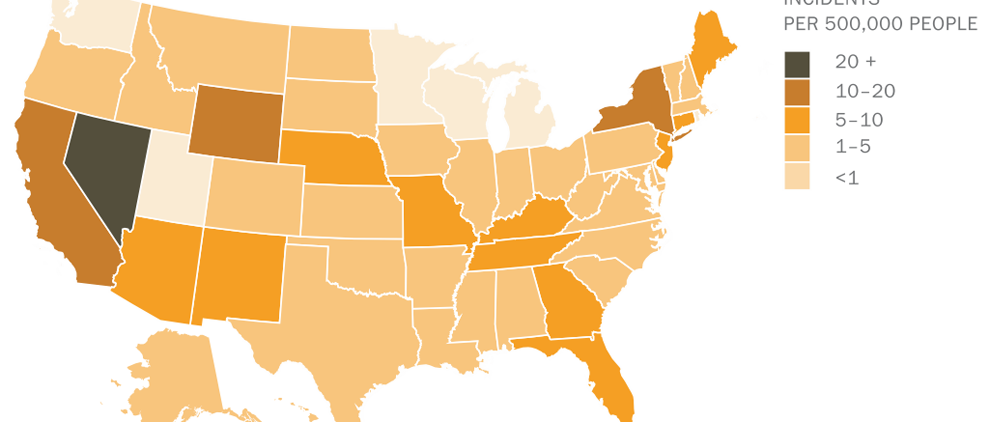
In the heat map below, the geography doesn’t really show much of an interesting pattern. The incidents distribution seems very random geographically, and people don’t really need a map to understand the data.

The information could be better presented as below, which reveals the actual number for each state and its ranking. It turns out that Nevada has incidents more than three times that of Colorado, the state in second place. This important fact, however, was totally hidden in the map above, which only shows a simple division of categories. Presenting the information in the most accurate way is the key of data visualization. So don’t be obsessed with a map if it doesn’t help better tell the story.

So now … What should I do next?
If you are ready to dive into data visualization, Yoo suggested several starting points for beginners.
Book
The Wall Street Journal Guide to Information Graphics, Dona M. Wong

Tools
Excel is the easiest one, Illustrator gives you more styling options, and if you know basic Javascript, Highcharts.js is a very cool tool worth trying.
People
Alberto Cairo @albertocairo
Tweets by @albertocairo
//
Andy Kirk @visualisingdata
So what is your experience with data visualization? Have you made some terrible charts before finally getting a clue? Share your work with us, whether it makes you proud or embarrassed. We are all learning!
You must be logged in to post a comment.