


While eye-catching data viz pieces like the Financial Times “Coronavirus tracker” or New York Times “The Pandemic Has Split in Two,” are accurate and effective for a numerically literate public, a number of graphic stories like these might prove challenging to the broader public that newsrooms may wish to reach.
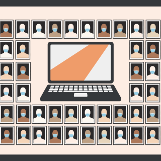
The United States ranks 28th of 33 countries in numeracy proficiency, according to The Program for the International Assessment of Adult Competencies (PIAAC) report. The PIAAC defines numeracy as “the ability to access, use, interpret, and communicate mathematical information and ideas, to engage in and manage mathematical demands of a range of situations in adult life.”
Researchers sat down with 245,000 people across 38 countries and administered a series of quizzes to test their ability to interpret data and quantitative information. They calculated their scores on 1-500 scale segmented into five Levels from least to most proficient.
The report found 63% of U.S. adults were unable to reach level 3 in the scale, which requires “interpretation and basic analysis of data and statistics in texts, tables and graphs.” Formal education seems to improve these results only marginally; 47% of high school graduates interviewed performed in Level 2 or below on the PIAAC report.
“For some time, [I feared] that we are moving towards a situation in which the news industry will serve people like me better and better—affluent, well educated, urban, white men.” said Rasmus Klein Neilsen, director of the Reuters Institute for the Study of Journalism at the University of Oxford at the ONA21 launch event for the institute’s annual Digital News Report.
Neilson raised important points during the launch at the ONA21 conference regarding the “news industries’ ability to serve historically underprivileged communities and local areas are withering.”
Data isn’t always objective
New technologies and digital delivery of news enables journalists to create data visualizations to support their reporting. Modern analytical methods allow flexible uses of data that can support multiple perspectives and competing analyses about the same data sets.
Chiara Sotis, environmental economist at London School of Economics, believes that the biggest misconception is that data is always objective. While data seems to promise objectivity, instead it requires analysis that can be filled with subjective interpretation.
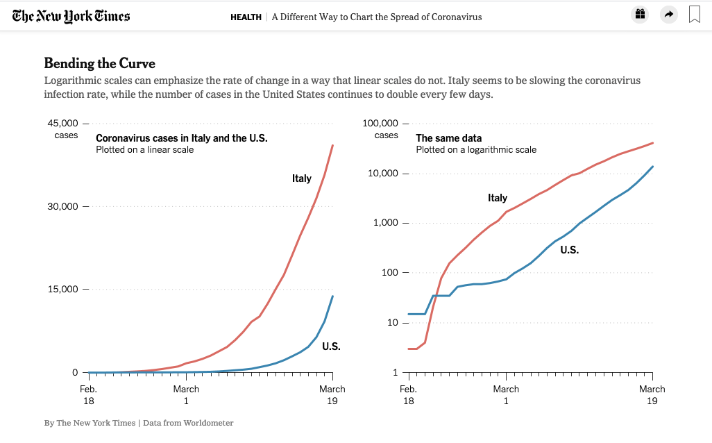
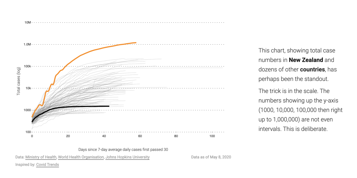
Sotis is one of the authors who conducted a survey of 2,000 people that revealed that “the public do not understand logarithmic graphs used to portray COVID-19.”
The researchers found that only 41% of participants could correctly answer basic questions when it came to a log-scaled graph compared to a linear scale.
The survey suggests that an important first step for effective data visualization is the selection of appropriate graph types and scales that favor an intuitive explanation.
In the case of COVID-19, a typical graph plots the number of cases on the y-axis, against dates in days on the x-axis. On a linear scale for the y-axis, the curve plotted in this graph has a simple interpretation, since the slope of this curve always represents the same absolute change in cases relative to the previous date. However, when cases are reported on a log scale, this slope represents the percentage change in cases relative to the previous date, which can prove confusing to those unfamiliar with the scale, and who are therefore unaware of this explanation.
Some news organizations see data visualizations as a way to educate readers. Kenneth Chang explained the rigorous use of logarithmic scale which is useful for readers who are not familiar with the difference between linear and logarithmic scale.
Another important issue concerns the amount of information reported in graphic form, which can quickly overwhelm a less numerically literate audience.
Sotis believes that graphs can help, but not if they try to communicate all the information together. “Some of the graphs we were looking at the Financial Times last year for instance, they were very sophisticated maybe for an expert audience. But for someone looking at it the first time, the risk is just so overwhelming that you don’t want to engage with. There is just too much happening in front of you,” Sotis said.
While data does allow journalists to tackle bigger stories and illuminate murky issues, it can sometimes require substantial background knowledge to interpret.
Walk users through data step-by-step
While the report show that the baseline numeracy in the U.S. is not great, it is important for journalists to be conscious about how much complexity the readers can handle.
Dan Zedek, a data journalism professor at Northeastern University and former design director at The Boston Globe said, “visualization should unfold in several steps [taking the reader] through it and help the reader explore step by step instead of [crowding] the information all at once.”
Sotis cites one of her favorite games, the Assassin Creeds Saga, where they walk the players through the historical buildings with small descriptions of when it was built, who decided to build them and other important facts. “It’s compelling and easier to engage with. [These kinds of methods] in data [visualization] can be used for learning within newer generations as they are really used to being in an interactive environment,” she said.
One great example of this is stuff.co.nz’s “The story of New Zealand’s COVID lockdown, in graphs” where they walk the reader step-by-step through the data which resulted in an effective form of visual storytelling.
This hints that news outlets can play a role in building curiosity and improving graph literacy within the readers. Matthew Conlen, former graphic designer at New York Times said, “repeated exposure of similar types of graphics can help the readers become more comfortable and familiar with understanding them.”
“Telling people how to interpret the world around them is much more helpful than producing the coolest [data viz piece],” said Sotis.


You must be logged in to post a comment.