This year’s ONA conference showcased some amazing work from a couple of very talented artists and designers. From the website to the name badges, each deliverable was executed with meticulous attention to detail in a marriage of lively colors and illustrations.
So what exactly went into the design of the conference experience? Plenty! Journey with us in this behind the scenes look at the design process for each item produced in designing ONA16, Denver!
The Inspiration
Believe it or not, it was all inspired by a single photo. Jeremiah Patterson, ONA’s Digital Manager who is responsible for their collection of websites, including journalists.org, conference websites and a multitude of other duties, wanted to be sure to capture the essence of Denver. The catch: to wrap it up into a simple logo that could not only be symbolic of the host city, but also represent the voice of ONA and the attendees of the conference.


The Process
Going a bit deeper, we discover there are many phases to drafting a logo. We can learn a lot about how the logo evolved by looking at Mr. Patterson’s approach which give clues to his thinking process.

Notice how one idea generally carries over to the next and concepts are mixed and matched from one sketch to another.
Typeface and contrast also play a very important role in picking the perfect logo. Balance is maintained with the thin/thick contrast with the typefaces as well as the light/dark contrast within the colors of the logo.


Building the Brand
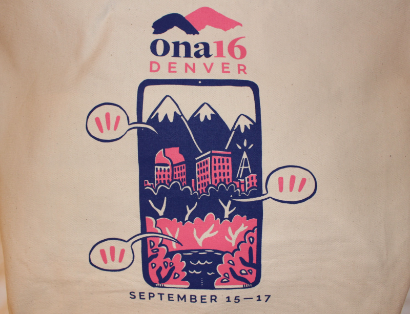
Joyce Rice, a cartoonist and illustrator who is also a Fellow making games at AU Game Lab designed the illustrations that could be seen painted throughout ONA16 branding. She really wanted to tell a story with her design with the goal of conveying the imagery of Denver while visually narrating the lives of the journalist attending ONA16.


The cover design by Mrs. Rice was also used to create the all of the cool handout items or “swag” such as t-shirts and totes as memorabilia for conference attendees.
#ona16 beautiful cover design by AU grad student @teenyrobots tho her’s is right-side up! pic.twitter.com/MhLDuR49lK
— amy eisman (@aeisman) September 16, 2016
What was your favorite piece from the conference? Do you feel the design really captured the essence of ONA? Let us know what you think!


You must be logged in to post a comment.