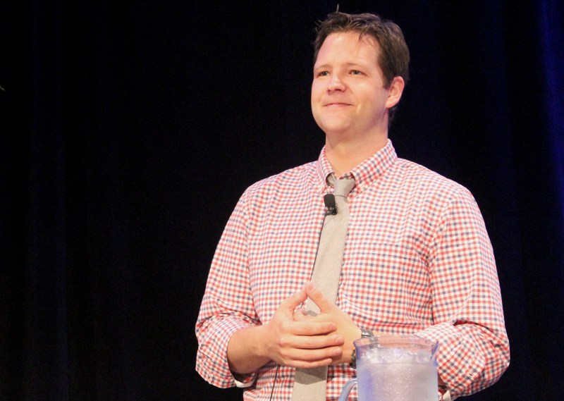
For NPR, the saying “mobile first” already applies to the way many of their listeners access stories. And, according to David Wright, digital design director at NPR, they may someday emerge as one of the first news organizations among their competitors to have more mobile than desktop traffic.
“People are used to taking NPR with them wherever they go. A phone is kind of like a radio now,” said Wright, who focuses on tailoring NPR’s audio and visual content to fit every platform in an interactive way. Wright has worked on NPR Books, NPR Music, platforms for NPR member stations, and most recently an iPhone app for the program Planet Money.
“We know that people are trading fidelity for mobility and it’s more important that we have a page that renders and functions,” said Wright, who is also working to improve how NPR stories are displayed off of someone’s newsfeed or blog. “The idea is for this to be a page that you can tweet and have a good experience with anywhere.”
Wright said paying attention to the design of certain features on news sites, such as advertisements, can make a major difference in users’ experiences.
“No one is ever going to invent an ad experience that doesn’t feel somewhat intrusive,” Wright said. “Come up with a way to make ads feel natively integrated so it doesn’t feel like you’re hanging up all these things on a Christmas tree but it’s well integrated and thoughtful. I think that really adds to the experience and makes them as tolerable as they can be. So we’re always going to have to pay the bills but that’s a direction I hope we can all push in.”
Oftentimes, said Wright, it can be challenging to convince reporters that they are good at design as they already posses a skill set for problem-solving. But designers, he said, have a lot to learn from journalists.
“Getting out and talking to people is such a weird thing for us product people, but reporters understand that,” Wright said about learning how listeners and readers are likely to interact with stories. “It would be a great way to integrate reporters into the design process by saying, ‘You’re better at this than us.'”
Wright said there are many frameworks out there for journalists who are looking to get started with designing for mobile platforms. Here are a few of the places where Wright said he is drawing inspiration from these days.
- Lost and Found, NPR’s The Picture Show
- Pitchfork feature on Cat Power
- USA Today website and mobile app redesign
Recommended reading:
- A List Apart
- The Society for News Design’s Tangents
- Responsive Web Design by Ethan Marcotte
- Works by web designers Anthony Zeldman, Jeff Croft and Alexander Shaw
Where to get started designing for mobile platforms:
- Bootstrap by Twitter
- Foundation by ZURB


You must be logged in to post a comment.